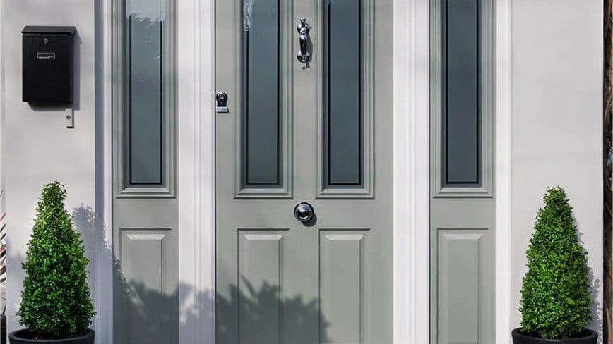
Start with what the house is made of
The door is not being chosen against a white background, it is being chosen against your brick, render or stone — and that material has an undertone that will either flatter the colour or fight it.
Warm red or orange brick sits well with greens, blacks and deep blues, and tends to clash with anything in the purple or magenta family. Yellow and buff stone, common right across this area, is flattered by sage, olive and duck-egg, and made to look dirty by brilliant white. Grey or white render takes almost anything, which is why modern houses can carry anthracite or a strong colour that would be too much elsewhere.
Match the age of the house, not the year you are buying in
Trends move faster than front doors do. A composite door lasts decades, so the question worth asking is whether the colour will still look considered in fifteen years, not whether it is current now.
Period properties are safest with the colours those houses were originally painted: blacks, deep greens, oxblood, dark blues. Victorian and Edwardian houses in particular were rarely light-coloured at the door. Interwar semis suit softer heritage shades. New builds and modern extensions can carry anthracite, which has been the most-requested colour in this trade for years and shows no sign of dating yet.
Match your windows, or deliberately do not
Two approaches both work, and the mistake is landing between them. Either the door matches the window frames exactly, which reads as calm and considered, or it is a deliberate contrast — a strong door against white or grey frames, treated as the one accent on the elevation.
What looks accidental is a door that is nearly the same as the frames but not quite. If you are going to contrast, contrast properly.
The practical points nobody mentions
Very dark colours on a south-facing door absorb a lot of heat. On a quality composite door with a solid timber core that is not a problem, but it is one reason cheap slabs with thin cores can distort over time, and a reason to ask what is inside the door rather than only what is on it.
Dark colours also show dust and pollen more than mid tones, and gloss shows everything more than a smoother matt-style finish. If the door faces a road, that is worth knowing before you choose.
One more: you can usually have a different colour inside from out. A bold front to the street and a plain white or oak inside the hall is extremely common and stops the colour dominating a small entrance.
How to look at samples properly
Never decide from a brochure or a screen. Get a physical sample, hold it flat against your actual brickwork at the actual door, and look at it twice — once in bright daylight and once on an overcast afternoon. Colours that look rich in a lit showroom can read flat under grey Fenland sky, and greens in particular shift enormously.
Then walk to the end of your drive and look from there, because that is the distance most people will actually see it from.
Published August 2026 · Written by the Custom Choice team, Peterborough